Monday, 25 November 2013

Orphan: Film Review

For my second film analysis, I will be depicting the film “Orphan” to find which narrative structures are supported and discover those that are challenged.

Orphan, 2009, is an American mystery, thriller directed by "Jaume Collet-Serra". Targeted towards individuals who prefer the more psychological thrill rather than “blood and guts”, it is likely that predominantly, females at the age of 18-30 will be the spectators scaring themselves silly with this “evil child” movie.

Based around the story of a young couple adopting a 9 year old girl, Esther, after losing their fourth baby through a miscarriage, the plot soon changes after discovering that she isn’t the innocent, calm and collected 9 year old she presented herself as when they went to visit her in her care home. Portraying herself as nothing but versatile, Esther turns into the once ordinary family of five’s worst nightmare.


The first narrative structure I will be writing about is one discovered by the Bulgarian philosopher, “Tzvetan Todorov”. Todorov stated that in a film, there was a beginning, middle and an end. Within these sections, the action followed the lines of; beginning with equilibrium, having a disruption to the equilibrium, recognising the disruption, attempting to repair the disruption, and then the end of the film discovering the equilibrium once again. When focusing on the film, Orphan, I feel the structure is used throughout the scenes to present the audience with this “mainstream” narrative and is definitely followed, however, at the beginning of the film, an activity that leads me to believe that there was never equilibrium occurs and then later on, the narrative structure begins with the equilibrium. At the beginning of the film, the flashback of the mother’s trauma is shown through the explicit scene of the mother having a nightmare about giving birth to her already dead baby girl. The fast paced, shocking scene soon ends and begins with the next, calm scene that begins the narrative structure that Todorov stated as the family of five are playing in their large, beautiful house, as normal families would. When Kate, (Vera Farminga), and John, (Peter Sarasgaard) visit the children’s home, in hope to find their dream child, Esther is the one who soon catches their attention when seen sitting on her own, painting. 


Her persona comes across as mature and interesting for a 9 year old girl as she begins talking to the couple and slowly persuading them to choose her as their new edition to the family. When brought home three weeks later, Esther carries on to be her usual, well-mannered self when she learns sign language for her newly sister, Max, (Aryana Engineer). As both of her newly brothers soon become aware, Esther is the child who causes all of the damage within the family home and accidents begin to happen. As we as spectators are aware of the incidents and who causes them, the equilibrium is disrupted. Esther begins to plot murderous plans on the family and out of the blue, attempts to seduce the father. The mother, Kate, is aware of the strange behaviour in Esther but the father, John, isn’t willing to believe it. Having acknowledged Esther’s behaviour, Kate recognises the disruption and then attempts to repair it through speaking to Esther’s previous carers and finding records on her. To her astonishment and soon the spectators, we find that Esther is actually an elder woman in a younger body. As Esther’s carers and previous carers begin to mysteriously die, the family decide to investigate further until Esther attempts to kill the mother and sister by chasing them with a gun. The equilibrium is once again found after the faced paced scene ends when the mother kicks Esther’s head and she falls into a frozen lake. Despite the vicious, horrible death, the equilibrium is found through the relaxation the spectators find, knowing that she can’t harm the family again and all of the chaos is gone. 


When focusing on binary opposition, it is clear that Orphan has involved this narrative structure through good vs. evil. Esther is presented as a calm and collected child at the beginning and as the truth is unwound, we get to see the complete opposite in the same character when she plays a disturbed elder woman, psychopathically killing her nearest. At the same time, we are also influenced to believe that the plot follows “good vs. evil” by us being led to believe that Esther’s family are the good characters, having brought Esther into their family and attempted to make her one of their own, whereas Esther is the evil character who quite clearly is there to disappoint.

For my third and last narrative structure, I will be focusing on Vladimir Propp’s theory of character types.  Believing that all stories involve characters who can be organised into different character types including, “The villain”, “The helper”, “The donor” and “The hero”, to name but a few, I have investigated into whether this particular film follows this structure and found that it more so does than doesn't.

As a conclusion to this analysis, I have found that all of the three narrative structures are followed throughout the film Orphan; however specific parts such as all of the character types being involved are not. As an addition to these specific narrative structures, I would also suggest that genre structures are included within this film by the specific horror conventions that are shown, including evil children which was a popular convention in the 1970’s. 

As seen in the table I have produced, Esther is both the villain and the false hero. As stated, Esther presents herself as the “families missing piece”, filling in the gap of their family and proving to be every parents dream through her actions. Quite obviously, this was all an act and Esther presents her real self as the Villain when she begins to murder and tear the family apart through her wicked ways. Having noticed quite early on that Esther was not a normal child, Daniel helps the family to recognise her bad intentions and gives Laura something to worry about. Laura begins to investigate through Esther’s past and is given information by Sister Abigail, who would be classed as the donor. At the end of the film, Kate fulfills the family’s needs by getting rid of Esther and killing her. For this reason, I feel as if Kate has become the hero in the other characters eyes as the equilibrium is found again. Other character types such as the dispatcher and the princess are not included.

The Orphanage: Film review

The Orphanage, 2007, is a Spanish drama, mystery and horror film produced by director, Guillermo Del Toro. Often related to “The Others” and “Pans Labyrinth”, The Orphanage is known as a psychological thriller when introducing the main focus of “imaginary friends” and the fearful idea of evil children. Targeted towards 15+, The Orphanage includes no gore, just bone trembling tension as the spirit world of the orphanage begin to play little games on the new family moving in, introducing a melodramatic, family detective genre. 

When depicting the film, the plot follows the lines of a young couple moving into a new home, an old orphanage that the female once lived in as a child. Hoping to create a home for handicapped children, Laura, (Belen Rueda), and Carlos, (Fernando Cayo), adopt a son who soon catches their attention when seen talking to some imaginary friends and following hunts that have been organised for him to enable secretive information to be fed into Simon that he was unaware of beforehand. “Simon”, (Roger Princep), is no ordinary child and after a party celebrated in the home, he goes missing and is only thought to have been captured by the spirits playing games with him.

 The Orphanage, like many other movies of its kind, has a simple narrative structure that has been identified as “Todorov’s theory”. Beginning with an equilibrium, otherwise known as a status quo, the opening of the film proves a certain balance in society. Before long, the disruption of equilibrium takes place by a certain action, producing a problem that needs to be solved. A recognition of the disruption is discovered and then an opportunity to repair the disruption is attempted before the equilibrium is once again stable. Todorov’s theory is proved in a lot of films as the basic structure. In The Orphanage, the beginning of the film, as already noted, portrays a normal family moving into a new home with the intentions of creating a home for handicapped children. 

As the son is seen talking to his imaginary friends, the normality of the plot alters and as the film continues, the supernatural themed story disrupts the equilibrium. As the son goes missing and the parents are aware of the circumstance, the parents go through medium activity to attempt to identify what the supernatural spirits living in their home want from the family. By doing this, the family are in an attempt to repair the disruption. After the mystery continues and the mother is becoming more and more agitated, the action continues to take place as the son is found dead in the cellar of the house. As an end of the story, the audience and characters within the story are aware that the mother’s disturbance was out of control and that she actually accidentally murdered her son in an attempt to help him. Due to the abrupt end to the plot, the mother destroys her own life. To confirm Todorov’s theory, we are able to establish that through the death of the mother and son, the father’s life continues through the slow paced equilibrium that the last scene brings as all of the chaos has disappeared, despite the loss of his closest. 

 Binary opposition is another narrative structure that was identified by a French anthropologist and ethnologist, “Claude Levi Strauss”. Believing that the words we understand depend not so much on the specific meaning but the understanding of the opposite words, for instance Villain and hero, Strauss came up with a structure for films. These particular binary opposition structures for horror films included good and evil, sane and insane, rational and irrational and supernatural and human. At the beginning, binary opposition was used as a simple term and was easy to identify when viewing a film. In recent years, films include binary oppositions such as vampires vs. werewolves in films such as “Twilight” that are harder to distinguish. At an early age, we as humans develop an understanding on these opposites. As a starting point, good vs. evil is one that all young children can identify visually through specific actions or provoked from the feelings that are stimulated through the actions. Strauss identified that in films, situations can be reducible to two possible states and has no possibilities in the middle. In The Orphanage, good vs. evil is not a structure that can be identified; however three other definite binary oppositions are apparent. The binary oppositions within The Orphanage help the audience to distinguish the genre of the film by the structures being used as a framework. Throughout the film, “Laura” is presented as the protagonist character, whilst the spectator follows the point of view of her character, shown in all three binary oppositions. Despite there being one main protagonist, the antagonist alters between the different characters as the film plot develops. At the beginning of the film, the equilibrium of the scene also presents the rational humans as oppose to the supernatural spirits. As Simon is shown talking to his imaginary friends, Laura and Carlos behave like rational parents and assume that Simon is behaving the way he is due to having no siblings. 


However, when Simon disappears, the alienation between rational thoughts and supernatural power is hard to distinguish. As the story develops, the second binary opposition of Laura turning somewhat into an “investigator” from her normal motherly character is apparent whilst the question of “What actually happened in the past?” is brought up to the spectators attention. In the last few scenes of the film, the third binary opposition, Laura vs. Carlos, is distinguished through the argumentative characters. As the audience begin to take sides and feel certain disgust towards the father as he attempts to persuade the mother to leave the home and forget about Simon, the binary opposition suits the structure of protagonist vs. antagonist more as a film convention.


The last narrative structure that I will be focusing on is one by “Vladimir Propp”. Propp was a Russian soviet formalist scholar who discovered the basic character types in folk tales. Ranging from the villain, to the hero, all of the characters could be found within every film analysed. In the film, The Orphanage, I feel as if the characters are more so going against Propp’s theory than following the conventions due to the characters changing from the antagonist to protagonist as the film develops and only having the three main characters throughout the film with the supernatural characters in specific parts and the medium group in others. Whilst the supernatural children suit the “villain” stereotype due to being the subject that is most daunting and scary towards the audience, Laura and Carlos also become the villains by the thought of Laura going insane and becoming the character who seems to be causing most chaos. As the film develops, her disturbance goes out of control and by the accidental murder of her own son, she becomes the villain. As Carlos decides to get on with his own life and forget about the house, his son and their future, the spectator automatically looks at him as if he’s a bad person and judges his personal choice. After we are aware that the spirits only wanted love and care, we sympathise with the characters and no longer see them as villains. Laura ends her life in the hope that she can be with her son and the spirits once again, creating a heart melting scene and alters her character towards the hero character type by helping the spirit children who were lonely and in need of a mother. As a personal opinion, I wouldn’t class Simon as any of the normal character types that the protagonist character would be listed as by Propp as he wasn’t a hero, a villain or a donor, to name but a few. However, due to Simon’s ability to widen his parents imagination and to be the first to mention anything to do with the spirits, I feel as if he was the helper towards fulfilling the spirits needs. Lastly, the medium group best suited the donor character type due to them offering guidance and giving the hero, which would be Laura, a “magical object” for guidance. 

 As a conclusion, I feel as if the film chosen supports Tzvetan Todorov’s narrative structure theory and Claude Levi Strauss’ binary opposition theory, however not so much the last character type theory by Vladimir Propp. As my own opinion, I would also consider genre theories that support the horror film, The Orphanage, that includes horror conventions including spirits, old orphanage buildings, children with bags over their heads and sound that creates tension, fear and lots of jumping!

Survival of the Dead: Film review

Survival of the dead, 2009 is a horror film written and directed by the American- Canadian producer, “George A. Romero”. Also known for “Dawn of the dead”, “Land of the dead” and “Night of the living dead”, George A. Romero invites his audience into a whole new dimension full of flesh eating zombies with his “dead pentalogy” films as addition to other familiars, “The crazies” (1973) and “Diary of the dead” (2009). Known for his horror classics, Romero’s films are great for analysing and digging deep into the auteur theory by Andrew Sarris and investigating the best techniques into creating an imaginative horror trailer.

Brief plot outline:
As the dead returns to life and two Irish- American families, the “O’Flynn’s” and the “Muldoon’s” battle against each other, the question of “will the zombies ever change and eat anything other than humans?” is asked when Romero creates a follow-on film from “Diary of the dead”. When a group of National Guard deserters see a viral video created by “Patrick O’Flynn” (Kenneth Welsh), inviting other survivors into safety on “Plum Island”, the group find an abandoned armoured truck and begin their journey. Finding aboard a safe full of cash, the rogues decide to take the safe key with the luck that in the future, scientists will create a cure for the zombies and the money can be used for possibly the safety of the living. Arriving at the ferry station, zombies begin to attack, killing O’Flynn’s entire group and leaving him to climb aboard with the national guards.  As they enter Plum Island, “Shamus Muldoon” (Richard Fitzpatrick)’s intentions are shown by zombies of the island being chained up to objects that relate to them, including a mailman chained to a post box and a woodsman chained to logs and an axe. With the hope of the cure, Muldoon’s intentions are to keep the zombies alive whereas O’Flynn has only one thing in mind, killing them.

Which two scenes impressed you most? Why?
When watching the film, I found two scenes which stood out for me most in terms of being most pleasing to watch, being full of action, having inspiring mise-en-scene, dramatic sound and a great narrative. The first of the two was a scene that was set on Plum Island, with all of the predominant characters playing a part. The scene opens with the O’Flynn’s walking into the farm yard where one of Patrick O’Flynn’s twin daughters has been put into a horse run and is aimlessly walking up and down as a zombie. A male walks Jane O’Flynn’s (Kathleen Munroe) horse into the run with her as the asynchronous sound of Shamus Muldoon is heard stating “We tried this with a lot of the dickheads. We tried to feed them rabbits, squirrels and pigs. This time we’re going to try something bigger.” Muldoon goes on to explain how it’s more difficult for O’Flynn to kill now that it’s his own genes and how he might understand what he is trying to do with the other zombies now. Allowing all of the other chained up zombies to witness what he expects to happen and saying “maybe they’ll learn something”, all of the groaning, slow moving monsters stand aligned up against the gate before the gate is shot open and they all escape, violently killing people from Muldoon’s group.


 As the scene moves on, O’Flynn’s other twin daughter is seen walking through the woods in the dark. As she moves through the silent woods, diegetic, asynchronous sounds of twigs snapping and owls hooting is heard whilst a collision cut from silent to loud awakes the scene when a black silhouette of a person crosses the screen with dramatic music. The tension builds until a hand grabs a tree trunk in front of Janet. The camera zooms out and one of the national guards, “boy”, stands in front of her asking “What would you do with a million dollars?” The reason why I chose this scene as one of the most inspiring is due to the emotional, dramatic and heart racing activities that occur. As the most busiest scene in the film, I feel that the spectators finally get to see all of the zombies in a close-up, and get to see them ripping open bodies, killing people and genuinely filling the film with body horror, parallel music, low key lighting, quick montages and point of view shots of the people being attacked.

The second scene within the film that I chose as the most impressive was when Francisco (Stefano DiMatteo) jumps into the sea to get to the ferry for the group to travel to safety. Jumping into the water, Francisco begins to swim to the ferry shown by an aerial shot. Others from O’Flynn’s group begin to shoot from an old barn, firing bullets into the water, shown slowing down from a low angle as Francisco successfully dodges them whilst swimming towards the ferry. A handheld camera allows quick montages and canted angles to illustrate the fast paced action going on whilst zombies from underwater begin to attack Francisco. A collision cut repeats from quiet diegetic underwater muffles to loud splashes and firing of bullets over water. Biting the zombie’s finger off, he manages to swim on and safely climb aboard the ferry. The reason why I chose this scene is due to the exciting, fast paced action and quick montage that added to the tension of whether Francisco was going to make it to the ferry or not. Using many techniques that are common for horror conventions meant that the spectator gets a sense of how the character within the film feels; disorientated, frustrated and panicked.

How has watching this film helped you understand this genre of filmmaking? Which features on the genre checklist did you spot in the film? When? How?
Watching “Survival of the Dead” gave me a chance to dig my teeth into the horror genre and analyse all of the different techniques used and determine which of those worked and which didn’t. Some of the features I witnessed within the film included parallel music, body horror, quick montages, the male hero, the final girl, collision cutting, slow moving monsters and the fear of death. Firstly, when focusing on parallel music, I felt that all scenes that needed tension had dramatic music, all scenes that were fast paced had rhythmic music and all scenes that were slow paced had mysterious, quiet music. An example of this within the film is when Francisco began to swim from the truck to the ferry. As Francisco bites the finger off a zombie, slow, mysterious music comes on as the finger slowly drifts down to the bottom of the water, illustrating disturbance and giving the spectator time to analyse what has happened.


The second feature, body horror, is one that was used throughout the film and is even used in the scene just described. From shooting the heads off zombies to ripping bodies open, the body horror within “Survival of the Dead” is much like all the other films created by George A. Romero and is designed to be graphic and stomach turning. By witnessing gore such as this, I feel that if I were to include body horror in my trailer, I would use some of the imaginative techniques that Survival of the dead includes, making it visually realistic and vile to watch.

When focusing on characters and representations, the male hero and final girl were two characters that I thought stuck out effectively. The final girl, “Tomboy”, is a stereotypical homosexual female that acts as more of the male character than some of the males within the film. Leaving on the ferry at the end, the spectators are able to establish that she is the final girl as the other two sexualised twin sister characters die, being the female victims.

The male hero, Sarge, began the film by being the strong character that takes over and does the more masculine, mature activities and ends the film leaving safely on the ferry. Stereotypically, Sarge appears like the male hero, being tall, brown haired, and muscly with stubble. Collision cutting and quick montages both play an important part throughout the film, making the action seem exciting, frantic and quite simply out of control. Going from quiet to loud also gives the horror film a slight fear factor, surprising the audience by this sudden change, making our heart race. The last feature, fear of death, was used in specific scenes such as when “Boy” was collecting water from in the woods. Forgetting his gun, “Boy” cowardly walks through the woods with only his bucket for protection. Looking around in every direction, the camera plays with his fear, tracking his movement as if somebody is watching him. As the slow, rhythmic music gets louder, the tension increases. When the music calms down again whilst Boy collects his water, a sudden collision cut happens as an ear piercing crow flies straight under the camera, making the fear play on the spectator’s minds, just like the character within the film. Walking back with his bucket of water, he steps quietly, looking around him until the figure of a zombie walks in front of the camera, making him jump in his step. As an overall ending, I found that it was open, due to the three survivors, Tomboy, Sarge and Boy boarding the ferry with all of the money from the safe. Muldoon and O’Flynn are both seen left on the island, both as zombies and still attempting to kill each other.

Which aspects of the film would you like to include in your own trailer? Why?
Having watched this film, I have come to conclusions over which features I would like to include in my own horror trailer. These aspects include; parallel music, close-up shots, gory sound effects, realistic body horror, fast paced action and quick montages. Having chosen these features, I feel that a lot of my trailer will be made up of technological features that make the film full of tension, suspense, drama and fear. A particular scene within the film that highlighted many of these features is when the zombies were set free from the barn and began tearing open bodies whilst quick montages illustrated how many lives were being taken. The soundtrack was parallel and gave the scene more emotion with the explicit sound effects of ripping open flesh and eating it, shown with close-up shots to show the spectator every bit of detail for the added effect.  

Which aspects of the film would you like to avoid in your own trailer? Why?
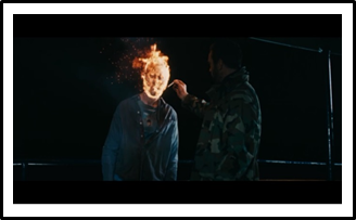
On the other hand, the features within this particular film that I feel didn’t work and will avoid using in my own trailer include; voice-overs, sex and the taboo and humourous gore. At the beginning of the film to almost half way through, a voice over narrator, Sarge, tells the story through his eyes whilst acting out the information being told. By doing this, I felt that the horror aspect of the film was taken over by the typical conventions of an action film and by watching this I felt less inclined to feel fear towards the slow paced plot. In other scenes, humourous gore is used to add comedy to the horror. An example of this is when the national guards were traveling on the ferry to Plum Island. When a zombie walks into the shot, one of the guards, Sarge, attempts to kill him with the nearest object to him. Being on a ferry in the middle of nowhere, Sarge grabs him and punches him in the face, pushing him in the railing of the ferry. Grabbing the emergency fire gun from the ferry’s wall, Sarge fires it into the zombie, leaving his face illuminated with fire, almost like a sci-fi character. Walking up next to him, Sarge lights his cigarette by the zombies face before violently kicking him into the water.
By adding the humourous death and Sarge’s calm attitude towards the zombie, I feel that George A. Romero plays on the zombie deaths to add imagination and creativity to the film. Despite this, I feel that the humour defeated the object of the fearful horror and due to wanting a serious horror trailer; I will not be adding humour into my film. The last factor, sex and the taboo, was used in one particular scene within the film. We are first introduced to the female character, Tomboy, whilst she is doing explicit sexual activities. Due to this, I found that the target audience for the film is seen to be predominantly teenage males, leaving spectators such as me feeling uncomfortable and slightly disengaged from the film. 

What was the bests aspect/ more enjoyable moment in the film? Why? Can you recreate this in your own film? How?
For me, the best scene within the film was the last five minutes. As Sarge, Tomboy and Boy drift off into the distance on the boat, a voice-over of Sarge states “We decided to take the money and run. Still, I wondered, what if we could teach the dead to eat something that wasn’t us. I guess we’ll never know”. A sudden cut changes the scene to the next, presenting us with zombies ripping open and pulling out the intestines of a live horse to then eat it.  A voice-over begins again as O’Flynn enters the frame, stumbling and tripping, having turned into a zombie. The frame cuts to exactly the same shot, however this time Muldoon stumbles in. An extreme long shot of the two characters standing on a hill at a short distance from each other is captured before both zombies retrieve a gun from their pockets, firing at each other aimlessly with no bullets left in the gun. The reason why I chose this scene as the most enjoyable throughout the film is due to the dry sense of humour that the open ending leaves. 


Having fought the whole film for only one reason; power, the ending represents how lonely and frivolous the characters are now, having achieved nothing and how pointless their family feud feels now that the zombies are eating animals and not humans. However, the predominant characters have all been killed or turned into a zombie themselves. I feel that I would be able to recreate this dry sense of humour into my horror film by adding a slight “pointless” open ended narration and illustrating how at the end of the day, “you get what you give”.


How does the film show the influence of its “auteur” director? How does it show the director’s filmmaking style and soul? Give examples of three scenes from the movie that show their auteur style.
George A. Romero has his own “auteur director” style in terms of filmmaking. Three of the most well-known examples of his styles are; flipping character stereotypes, introducing anti-sexism into his films and introducing political satire. When focusing on flipping character stereotypes, I feel that Romero introduced this theme in the scene where Tomboy kills Francisco. Having bitten the finger off a zombie, Francisco realises that he doesn’t have much time left until he will become one. Losing strength and hope, Francisco runs away into the woods, leaving Tomboy chasing after him. Realising what she has to do, Tomboy shoots him directly in the head, killing him straight away. Having made Tomboy the character that ends Francisco’s life, I feel that Romero attempted to illustrate how strong she was as a person and how in any other film, the female character would cry, scream, shake and disagree with the arrangement.


Anti-sexism within the film is used in many of the scenes that Tomboy is in, linking in with the idea of flipping character stereotypes. By having Tomboy in the film, playing a national guard, I feel that Romero intended to prove how it’s not only men who act as the strong, capable characters and due to being a final girl, could be classed as a hero also. An example within the film of this theme is when Sarge, Tomboy, Francisco and Crickett circle a group of strangers in the forest, interrogating them before killing them. Being part of the group allowed the film to show equality and how she was at the same level of the males.  Lastly, the theme of political satire within the film was illustrated through the use of zombies and the evolution of the war through the conflicts in Ireland. I feel that George A. Romero introduces the idea of war into this film and represents how it destroys nations by the last sequence of the zombies taking over the whole of Plum Island.

Insidious: Film review

Insidious, 2010, is an American horror, thriller film directed by the Australian film producer, script writer and film director, James Wan.  Teamed with “Paranormal activity” writer/ director “Oren Peli” and the producer of Saw, “Leigh Whannell”, James Wan creates a twisted take on the usual haunted house movies, taking a huge £54,000,000 at the US box office.  


Brief plot outline:
When a family of five decide to move into a new home, the son of Josh (Patrick Wilson) and Renai (Rose Byrne) falls from a ladder and hits his head, leaving him in a coma for over 3 months. Visiting the hospital, the doctors have a mysterious case on their hands, when discovering that there are no explanations to Dalton’s (Ty Simpkins) coma. For the next few weeks, the family decide to take care of Dalton and monitor him carefully in the comfort of their new home. When inexplicable, perplexing activities begin to happen, the couple experience life changing, bone trembling events that take place right in front of their eyes including; unfamiliar noises, faces and people in their house. After moving house for the second time and hearing a muffled male voice over the baby monitor, Renai invites mediums and investigators to her home, revealing the demons that lurk the soul of their son.

Which two scenes impressed you the most? Why?
After watching this film, I have found two distinguishing scenes that I feel are the most impressive in terms of cinematography, editing, sound and narrative. In the first of two scenes that I found most inspiring was a short take that can be missed by lack of concentration or the blink of an eye. This scene was used for the startling psychological thrill of those who witness it. As the tracking shot follows Renai through her house whilst she does mundane, normal everyday tasks, standing in the corner amongst the coats is a young boy dressed in Victorian clothing facing the wall. As the camera carries on through the house, only the audience are aware of the child’s appearance. The suspense of “when will he come out?” “what is he doing?” “is he going to jump out?” is running through the spectators minds, waiting for the action to happen. As Renai turns her record on, she walks outside to put the bins out, looking through the window on the way back in. We first see Renai’s facial expression, triggering our knowledge of the boy and how he will be in the next shot. A point of view shot from Renai’s position shows us the young boy dancing in front of the record player, having changed the song to “Tiptoe through the tulips” by “Tiny Tim”. The relevance of the lyrics “..through the window” has been used purposely in this scene as addition to the contrapuntal creepiness of the music which is generated through the upbeat song yet unsettling high tone. I chose this scene as my favourite due to the dramatic irony shown through the clever insertion of the clip. Seeing the action before the character within the film does meant the spectator feels a sense of uncertainty due to the film acting as if nothing has happened. The spectator also has no control over when it was going to happen, leaving suspense and uncomfort. I feel that this scene plays on the mind of the audience and adds to the psychological atmosphere, making the audience shout at their screens to inform Renai’s character or feel the need to re-wind the film to get another glance for clarity due to the shot only lasting for a few seconds.

The second scene of the two that impressed me the most throughout the film was a 3 minute scene of Josh walking around the haunted house from within the mind-set of his inner soul. The low key lighting of the scene is emphasised by the motivated lantern light that illuminates all of the important subjects within the frame. The slow moving monsters shown to be spirits gradually get closer to Josh, acting as a threat towards his life. I chose this scene as my second choice due to the fantastic use of shadows, connoting and enhancing the evil within the spirits. The sound within this scene is incredibly silent, with no use of dialogue. The slight sound of a whistle is heard and as Josh moves around the building, the sound of the whistle increases until he reaches the elderly gentleman creating this sound. An asynchronous sound of a gunshot is then heard and an over the shoulder shot of three of the spirits with a gunshot through their stomach is shown, seeing the gun in the other spirits’ hand. A sudden collision cut from silence to loud music awakens the scene as Josh backs off slowly. A quick shot showing Josh looking up the stairs and then back to the scene again is shown just as all four of the spirits suddenly appear in front of him, staring idly into his eyes, whilst also confronting the audience in claustrophobic close-up shots.

How has watching this film helped you understand the genre of filmmaking? Which features on the genre checklist did you spot in the film? When? How?
Watching this film has helped me to understand the horror genre more clearly by the great use of features that are made evident to being typical conventions. When focusing on cinematography; panning shots, tracking shots and zooming have been used frequently to allow the audience to see all of the action right in front of their eyes. An example of this within “Insidious” is a scene in which cinematography has been used to make the spectator feel as if they’re a character within the story. One of the major motifs of the film, the song “Tiptoe through the tulips”, begins to play as the camera pans around from Josh and Dalton’s worried facial expressions, following their eye-line to a point of view shot of the Demon in his lair. We are shown this shot from a low angle, illustrating the demon’s power and superiority to the other characters that are shown to have less control. The music then becomes louder as the camera zooms out from a speaker, presenting the audience with close up’s of connotations that relate to the demon. These connotations include a clown’s mask that represents a hidden agenda and a typical horror convention, the lighting being red which represents danger and evil and the demons long, sharp, black nails, giving us a clear indication to the important themes within the film; fear, the unknown and possessiveness. The use of long takes and zooming are two effects that I believe work best when building suspense and tension, allowing the audience to be aware that something bad is about to happen but making them wait in anticipation. An example of this within the film is when a ghost buster is walking around the house, alone with his night vision camera. As he’s clicking the button, the screen goes from black to a point of view shot of what the character is seeing through the camera. As this begins to happen, the spectators are aware of what will happen due to the silence of the scene, hearing nothing but the click of the camera. The audience wait in anticipation for something to pop up on screen and sure enough, an old lady stands in the corner of the room as collision cutting is included in the scene, going from silence to loud, shocking music and the screams of the character. Another effect that links in with this method is the asynchronous sound effects. Hearing a noise before seeing it allows the audience to use their imagination further, being an intelligent convention of horror. An example of this effect within the film is when the record player is heard scratching and then changing to a different song. Seeing that Renai was outside at the time of this happening, the audience are still aware of what is happening without seeing it. Lastly, when focusing on the typical horror conventions, I found the setting in this film interesting. Using places such as attics, haunted houses and dark woods, Insidious creates a tense atmosphere in the scenes by using stereotypical horror setting conventions. Having seen this film and gaining an understanding on the settings and their uses, I feel that I will be taking these into consideration when creating my horror trailer.

Which aspects of the film would you like to include in your own trailer? Why?
Other aspects of this film that I feel I will use in my trailer include; jumpy scenes, motifs that signify specific horrors within the film, collision cutting and fast moving monsters. Having seen both slow moving monsters (the spirits) and fast moving, smart monsters (the demon), I have been able to distinguish the difference between them both and how the different speeds can determine what kind of creatures they are and what they represent. Due to this, I feel that fast moving monsters are the most powerful, creating more of a fearful thought and these are used more often in contemporary horrors to maximise the fear. 

Collision cutting can be used in many different ways including slow to quick, quiet to loud and long-shot to close-up. These techniques are all used to shock the audience and make them jump. Using this method within my trailer will create a sense of power and control over the audience’s heart rate, getting it pumping and illustrating fear. Motifs are intelligent ways to make a horror film memorable. By adding a specific object, soundtrack or sound effect that is subtly repeated, the audience will see this and relate it to the fear of the film. Using this will engage the audience to the film and make them remember it every time they see or hear the motif in or out of the film. Having seen motifs in Insidious such as; the song by Tiny Tim that allows the audience to be aware of the demon taking over, the sudden collision cut from silence to a harsh, loud soundtrack that illustrates to the audience that the action has begun and recurring images of Dalton’s drawings being found of demons and peculiar objects that later on relate to this whole other world, I feel that I will take these into consideration when designing my horror trailer.

Which aspects of the film would you like to avoid in your own trailer? Why?
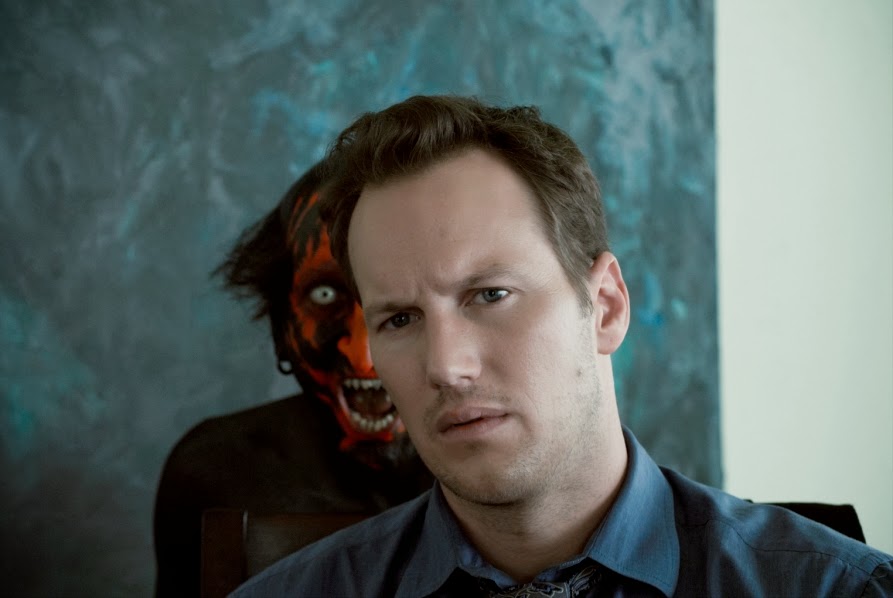
Aspects from within “Insidious” that I feel I would avoid when focusing on my horror trailer include; humour, emotional/romantic narratives, taking a while to get into the horror plot and the use of poorly designed “monsters”. In “Insidious”, the antagonist character within the film was shown in multiple shots. Seeing the demon made it impossible for the spectators to use their imaginations in terms of the demon’s appearance. Having seen the demon, I felt let down by its appearance and noticed how the character had merely been painted red and black. By this, I lost sight of the story and focused more on the creation of the film rather than it being a true story. In other scenes, humour was overused, for instance with the two “ghost buster” characters with their image and constant facial expressions and jokes. The use of humour defeated the horror and destroyed any hope of me being scared of the film. Lastly, from the beginning of the film up until almost half an hour, the narrative is still focusing on the family and their emotional issues. Romance and feel-good conventions from romantic films were used and I felt the film dragged on too much until it got into the horror.

What was the best aspect/ more enjoyable moment in the film? Why? Can you recreate this in your own film? How?
In conclusion to this review, I feel that the most enjoyable moment in the film was when all of the horror action began. As Josh steps out of his own body and into this new, gruesome, horrifying world, the scenes are tense, jumpy and faced paced. All of the typical horror conventions have been incorporated into this one scene and I feel was created effectively to unsettle the audience. Sound, cinematography, editing, mise-en-scene and lighting have clearly all been thoroughly analysed before the film makers designed this short clip. I feel that I can recreate this in my own film trailer by taking into consideration all of these stereotypical horror conventions and focusing on what my target audience find most powerful in a horror film.

Empire magazine cover analysis

For my third magazine cover analysis, I will be depicting one of Empires issues, #223 from January 2008 that is based on the new Batman film, “The Dark Night”. “Empire” is a British magazine brand, published by Bauer Consumer Media, focusing around everything to do with film. Starting from 1989, Empire is known to be the biggest selling film magazine in Britain, publishing their brand globally to other countries such as the United States, Australia, Turkey, Russia and Portugal. Being sold monthly, Empire sell their brand for £3.80 per issue and have a circulation of 167,748, dominated by males by 77%.

To begin my analysis, I have found that the main focal point is one of many conventions that help to signify the movie title by the iconic, dominating main image of the joker. Although “The Dark Night” is written above the main image, it is breaking conventions due to the small front and powerless appearance. By this, it is clear to me that the main image is powerful enough for the recognition of the film as addition to the iconic Batman logo positioned between the movie title and “World exclusive” and helps to emphasise the films title.

When studying the main image further, there are a lot of features within the frame that demonstrate the villain’s psycho nature. The joker is known for his unsettling make up, hair colour and costume that all demonstrate his peculiar, evil clown character. In this particular image, his body language is very powerful. By his open gestures, it is clear that the joker is attempting to appear patronisingly superior and in charge. When viewing the setting, we are able to establish that he is in a sell with bars behind him and police officers on patrol which is contradicting his facial expressions. Although a jail is meant to protect society from evil people such as him, this particular image is one that quite obviously shows the opposite by viewing the villain from the inside, allowing the spectator to feel entrapped and as if the officers are the ones who are behind the bars. The joker’s eye contact is one convention that movies from this genre particularly include and by doing this, the spectator feels involved. After viewing his direct eye contact, I feel as if his eye line has been positioned between the masthead to enable the spectator to acknowledge the brand name and remember it.  By covering up part of the masthead, I feel that Empire magazine is a brand that is familiarised by the public, meaning that parts of it can be overlapped by more important features such as the main image. By the main image overpowering the masthead, I would also suggest that this hints to be a powerful, block buster film that dominates everything.

The masthead for Empire magazine is always red and is positioned at the top of the page. By using such a dominating, eye catching colour, I feel that the masthead is instantly viewed and remembered. The bold, sans serif, upper case font is one that is easily read from afar and can then entice the particular target audience of film lovers.

The colour scheme used on the front cover includes blacks, purples and greens. These colours have been used as a motif towards the joker as he is always seen wearing these colours. Green, in particular, is a colour that is used to emphasise sickness. By acknowledging this, I would suggest that it has been used to hint the joker’s mentally disturbed character. Green is also a colour that is used to show energy. It is clear that the joker has an unusual amount of energy and is always on the go and causing more trouble. Purple is a colour that is usually associated with power, royalty and authority. By cause of this, I feel that it has been used to demonstrate the power in which the joker feels as if he has and how he controls the nation by his murderous, criminal actions. The rest of the magazine background has been filled in with black. Black is a dark colour that often resembles death. Along with this, black is the colour of the Batman himself and helps to create a connection between the magazine and the film.

For all of the other pieces of written information, a normal sans serif, upper case font has been used and is only written in white. Due to this, I feel as if all of the innocent features including “Sweeney Todd”, “One-on-one with Batman’s new nemesis!” and “The Mummy 3” is shown to be different to all of the written content that relates to the joker, that’s written in green or purple.  These bits of information have been separated all over the magazine cover in columns and in their own separate box’s to give other viewers who are not interested in Batman a chance to read about something of their interest.

“Meet the Joker” is one bit of text that is designed to relate to the film. This has been written in both green and purple and is in a font that illustrates cut out letters that would usually be associated with a newspaper. This kind of font would usually be found in ransom demands and in my opinion, has been written to emphasise the joker’s criminal history. Below this, “He’s a cold blooded, mass-murdering clown” has been written in a hand-written appearing font. This font has been used to appear as the jokers ramblings in an asylum.


The barcode is a convention that all magazine covers include. On this particular issue, the barcode has been positioned to the bottom left of the page, out of any important space. 

Fangoria magazine cover analysis

Fangoria, first published in 1979, is listed as a horror, slasher, splatter based American magazine that specialises around exploitation films. Edited by Chris Alexander, Fangoria is published monthly, reaching 46,000 people each year.

As my second magazine analysis, I will be depicting the creation of this particular issue and going into depth with the conventions of a typical horror magazine to enable as much knowledge on the topic as possible for when I create my own.

To begin my analysis, I feel that the main focal point, hinted by the central positioning and large size of the face, is Natalie Portman, playing Nina Sayers in the 2010 film, The Black Swan. Positioned behind the masthead and enlarged to fill the whole of the poster, the instant recognition of the well-known film is established and the powerful make up helps to create an eye catching cover for the spectator. This particular image has been used to influence the audience into understanding the general story behind the Black Swan by her tightly pulled hair, presenting her as a ballet dancer. Her hair, which is hard to define, is the only part of her face which gives the spectator enough information to clarify that she is human. Although the character is presented to be evil, she is still seen to be beautiful. By this, I would associate this with one of the horror conventions due to a lot of films making their female antagonist sexually appealing and making their persona deviating and manipulating.

The colour scheme used includes predominantly blacks, reds and blues. These three colours are the signifiers towards the Black Swan and also help to create unity throughout the cover, presenting the audience with a professional, sophisticated approach into the creation of the magazine which contradicts the conventional, busy and messy appearing magazines that horror genres typically prove. Due to the white face, I feel as if using white for the background helps the supernatural, unsettling feeling to be evoked, whilst enabling the more important aspects to be clearer and analysed instantaneously. These particular features have been outlined even more by the strong, harsh make up that helps to show her sour, evil facial expression, hinting the horror genre for anybody who is unaware of the thriller film. As addition to this, I also believe that her white face illustrates her innocence and purity, whilst the black make-up, shaped to be feathers, show her change of nature and how she has gone from good to bad through her acting and ballet. Another way of proving this theory is by her red eyes that represent evil and can be linked with the devil taking over her body.

The masthead on this specific issue of Fangoria is a bold red colour with a shiny, 3D effect. Having used these features, I feel that the horror film convention, blood, is influenced through the appearance as addition to the “F” and the “A” being shaped as if they’re two fangs on a vampire. This also hints the bloody appearance due to fangs being related this this convention. Below the main image is “Black Swan” written in a sans serif, upper case, red font. This information gives the spectators the knowledge of the film title in case they’re unaware and for promotional importance. The colour links in with the red magazine brand title, creating unity on the front cover.

Above the masthead, a strapline reading “Darren Aronofsky’s dance of death” is included. This pull quote helps to depict the film by stating that the ballet takes over her life and quite obviously destroys her life and kills her. The word death is one that is automatically linked with horror genres. By writing such a blunt line along with the film, the audience is, again, aware of the dark story that is like no other dance film, completely contradicting the innocence and beauty of ballet.

To the left and right of the main image, a few features and regulars from the contents of the magazine have been listed to enable an easier approach towards the audience understanding whether they would like to purchase the magazine or not. These bits of information, including “Dead Space 2”, “Vampire Circus” and “Stake Land”, are written in two columns in the three colours that are associated with the Black Swan.


Below these, a film strip banner has been presented at the bottom of the page with four different film stills aligned neatly.  This feature is seen in the majority of Fangoria magazine issues and provides the spectator with other films that may be of interest to them. For this magazine issue in specific, the audience may be uninterested in The Black Swan. By adding extra movies that are featured within the magazine, they may purchase the magazine purely for one of the other films listed. This film reel is additionally inserted to enable the target audience to acknowledge that the magazine specialises in films. The four films included are all of different sub-genres. This highlights the point that the target audience is a lot wider than just one specific horror sub-genre fan.

Total film magazine cover analysis

For my first magazine analysis, I have found a copy from the English brand, “Total film”. Starting in 1997, “Total film” publishes their magazine 13 times a year, having a circulation of 75,491. Basing their magazine around films, referring to the latest films that have come out, talk on the stars and film reviews, Total Film manage to fulfil all film fans dreams by giving them the full gossip on the interesting areas in film and sharing the most wacky photographs, and occasionally posters, with the buyer.

When studying the codes and conventions used to produce such a complimentary cover, features including the masthead, the main image, headlines and colour scheme, to name but a few, have been studied and influenced by the conventional techniques that are seen in the typical comedy based film, such as this.

To begin my analysis, I have noticed how the focal point on this specific cover appears to be the main image of Johnny Depp, playing the mad hatter in Alice in Wonderland. His wild, outgoing and enthusiastic appearance is presented with bright colours including his orange hair and pink eye make-up. Seeing as the background is a fairly dark colour, I feel that the colours have been arranged to enable the mad hatters face to be the main focal point and extremely eye catching. Another way in which his character represents his wild nature is the obscurity of clothing. Wearing a brown leather coat, a long sleeved puffy shirt, a liquorice allsorts patterned bow tie, a top hat and checked gloves, Johnny Depp has been transformed from his typical attractive persona to a socially awkward, unsettling, mad person holding a giant rabbit.

The masthead for this specific cover has been covered up by part of the main image. By doing this, it is clear that the brand is evidently well known, enough to the point that when it is covered up in sections, the spectator can still establish what magazine it is. The font used is a bold, sans serif that helps all aged viewers to be able to understand and clearly recognise the magazine when close up or at a distance. Using the colour white creates unity throughout the poster, linking with the white text and Johnny Depp’s face.
Above the masthead, a promotional point of sale quote has been written, stating that there is a “free giant iron man poster” included within this particular issue. Including this statement on the front cover persuades the target audience of film fans to purchase the magazine purely for the free gift. A gift such as this is bound to get the spectators interested. Having this written in a bright colour, yellow, and positioning it at the top of the page means that the audience will see this near enough straight away.

Between these two important features is the Total Film website with the price of £3.99 for the magazine, the issue number and the date it was published. These bits of information are a lot less important than aspects such as the masthead, promotional lines, and main image, and so are a lot smaller than all of the other written content. Despite being less important, they have been written collectively at the top of the page for anyone interested and for anybody purchasing the magazine.

Other written content including “Welcome to Wonderland! Johnny Depp heads up our MASSIVE 2010 PREVIEW” and “Starring…Iron Man 3, Harry Potter 7…” have been included to inform the spectator of the valued features and regulars included within the magazine.  Involving this information on the cover means that the audience can get a better understanding on the contents and whether they want to purchase this particular issue.
Below this information, more stars are listed in a larger font, hinting that they’re the bigger articles and ones that are likely to be of more interest to the majority of people, acting as a selling point.The barcode is positioned to the right of the main image and is adjusted to fit in the free space, altered to a portrait orientation.

The general colour scheme of the poster is eye catching and colourful to enable as much representation of fun to be shown as possible, linking in with the film “Alice in Wonderland”. The format of the contents are organised in a tidy way, having all of the information in a column on the left, the masthead at the top and the main image filling the whole page.